Designing an E-Commerce Experience for a Handcrafted Idol Brand
Mini Murtees is a handcrafted miniature idol and decor brand. The existing website showcased the products, but it did not guide users strongly enough from discovering the brand to exploring products and making a purchase. I redesigned the e-commerce experience to make product discovery easier, strengthen the visual presentation of the brand and create a clearer path from browsing to buying.

My Role
UI/UX Designer
I worked across stakeholder discovery, competitive research, information architecture, interaction design and high-fidelity UI. My focus was to understand how the website could work both as a digital showcase for the craftsmanship behind the products and as an effective e-commerce experience.
By The Numbers
7 Product Categories Mapped
10+ Product Screens Designed
At a Glance
Mini Murtees offers a wide range of handcrafted miniature idols and decorative products. I redesigned the website around a more structured browsing experience, clearer product categories and stronger product presentation so users could move naturally from discovering the brand to exploring individual products.
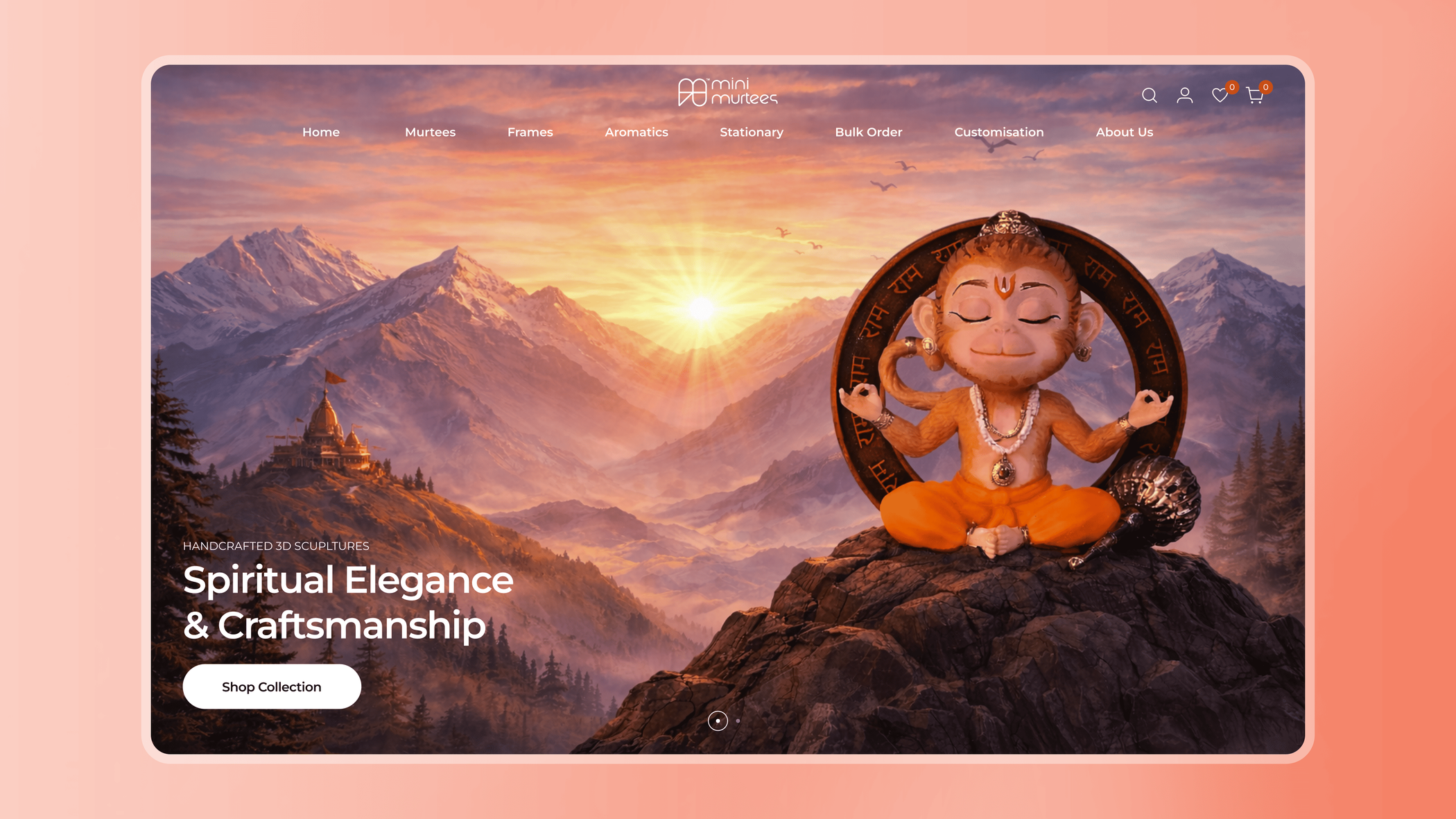
The Challenge
The previous experience primarily worked as a catalogue. Users could see the products, but the website needed stronger pathways to help them understand the range, discover relevant items and move confidently toward purchasing. At the same time, Mini Murtees is a visually distinctive brand.
Making the experience purely transactional risked losing the personality and craftsmanship that made the products appealing in the first place. The challenge was to balance two goals:
Create an engaging product showcase
and
Build a clear e-commerce journey
Discovery
I started with stakeholder discussions to understand the business goals, product positioning and limitations of the existing experience.
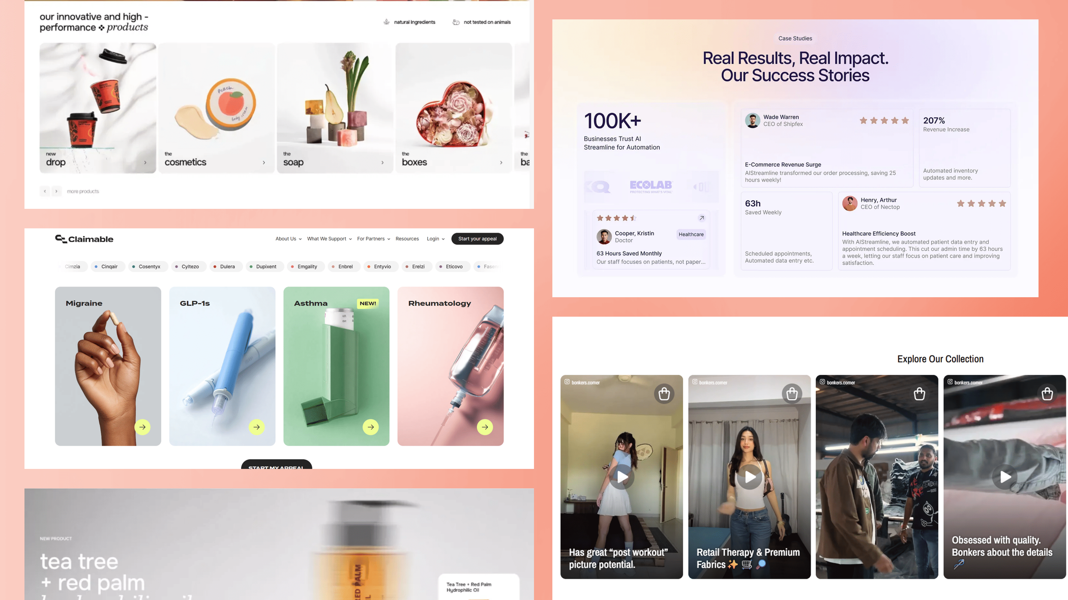
I also benchmarked other e-commerce platforms to understand how successful stores handled:
- Product discovery
- Category navigation
- Product information
- Visual merchandising
- Purchase-focused actions
This helped me move the redesign beyond visual improvement and focus on how users would actually browse and shop.
The Core Problems
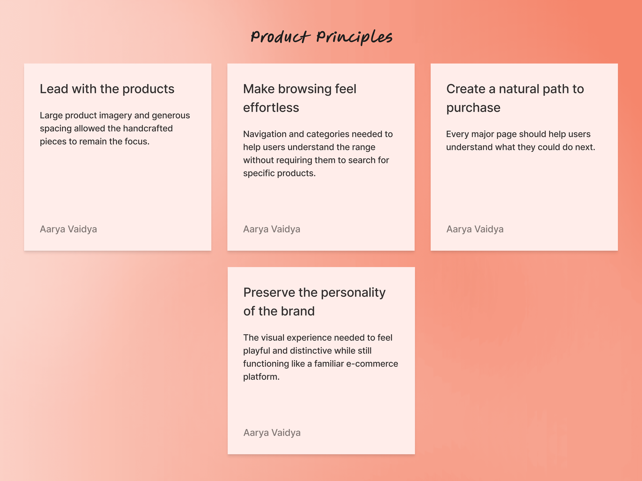
01. Make the product range easier to explore
Users needed clearer ways to navigate between different types of products without relying on a long catalogue.
02. Create more reasons to keep browsing
The experience needed to encourage exploration instead of ending after users viewed a single product.
03. Make purchase decisions easier
Important product information and purchase actions needed to be clear and easy to find.
04. Let the products remain the hero
The interface needed personality without competing visually with the craftsmanship of the products.
Product Principles
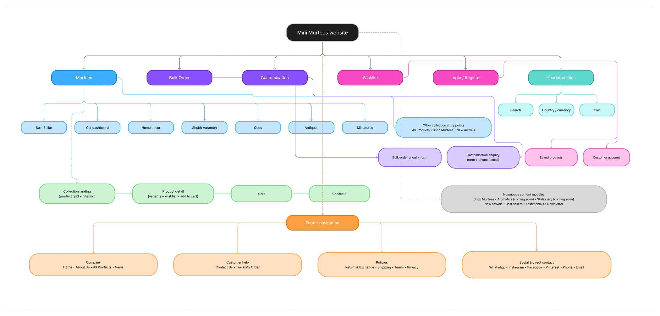
Information Architecture
The homepage needed to help users quickly understand what the brand sells, discover different product categories and find reasons to continue exploring. I structured the page around a progression from brand introduction to product discovery.
Homepage
The homepage needed to do more than introduce Mini Murtees. It needed to help users quickly understand what the brand sells, discover different product categories and find reasons to continue exploring. I structured the page around a progression from brand introduction to product discovery.
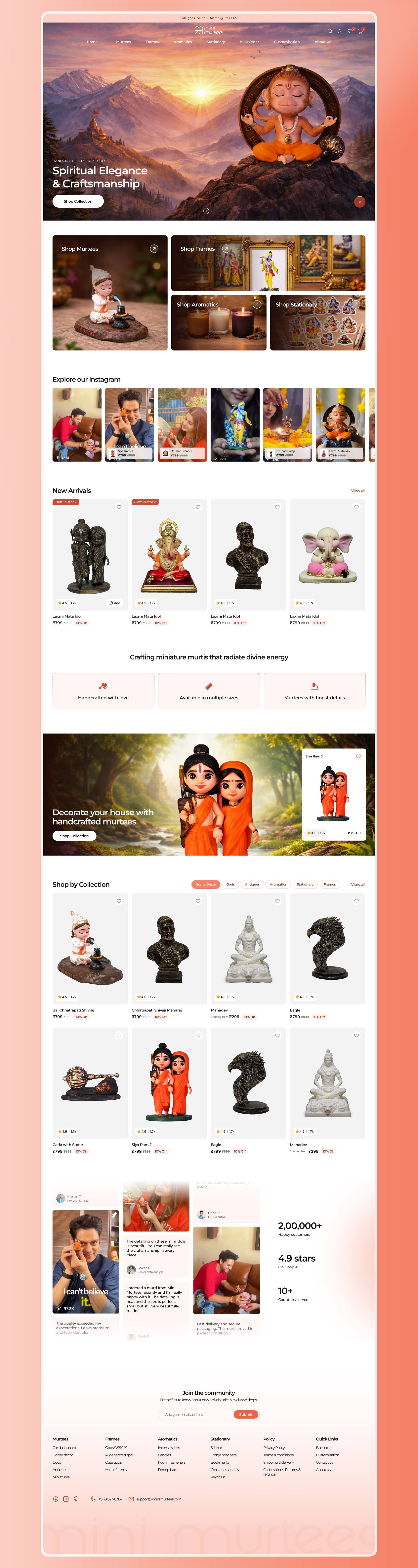
Product Discovery
Not every visitor arrives looking for a specific idol. Some users may be browsing for a gift, exploring a particular category or simply discovering the brand for the first time. I designed category and listing experiences that made the catalogue easier to scan and encouraged exploration across products.
The experience allowed users to move through the catalogue without requiring detailed knowledge of the product range.

Product Pages
Handcrafted products depend heavily on visual detail. The product page therefore needed to showcase the piece from multiple perspectives while keeping essential purchase information immediately accessible.
I organised the page around three priorities: See it, Understand it, Buy it.

Designing for Confidence
Unlike a digital purchase, users cannot inspect a handcrafted item before buying it online. The interface therefore needed to provide enough visual and product information to reduce uncertainty. I used clear imagery, structured details, visible pricing and familiar e-commerce interactions to make the purchasing experience feel predictable.
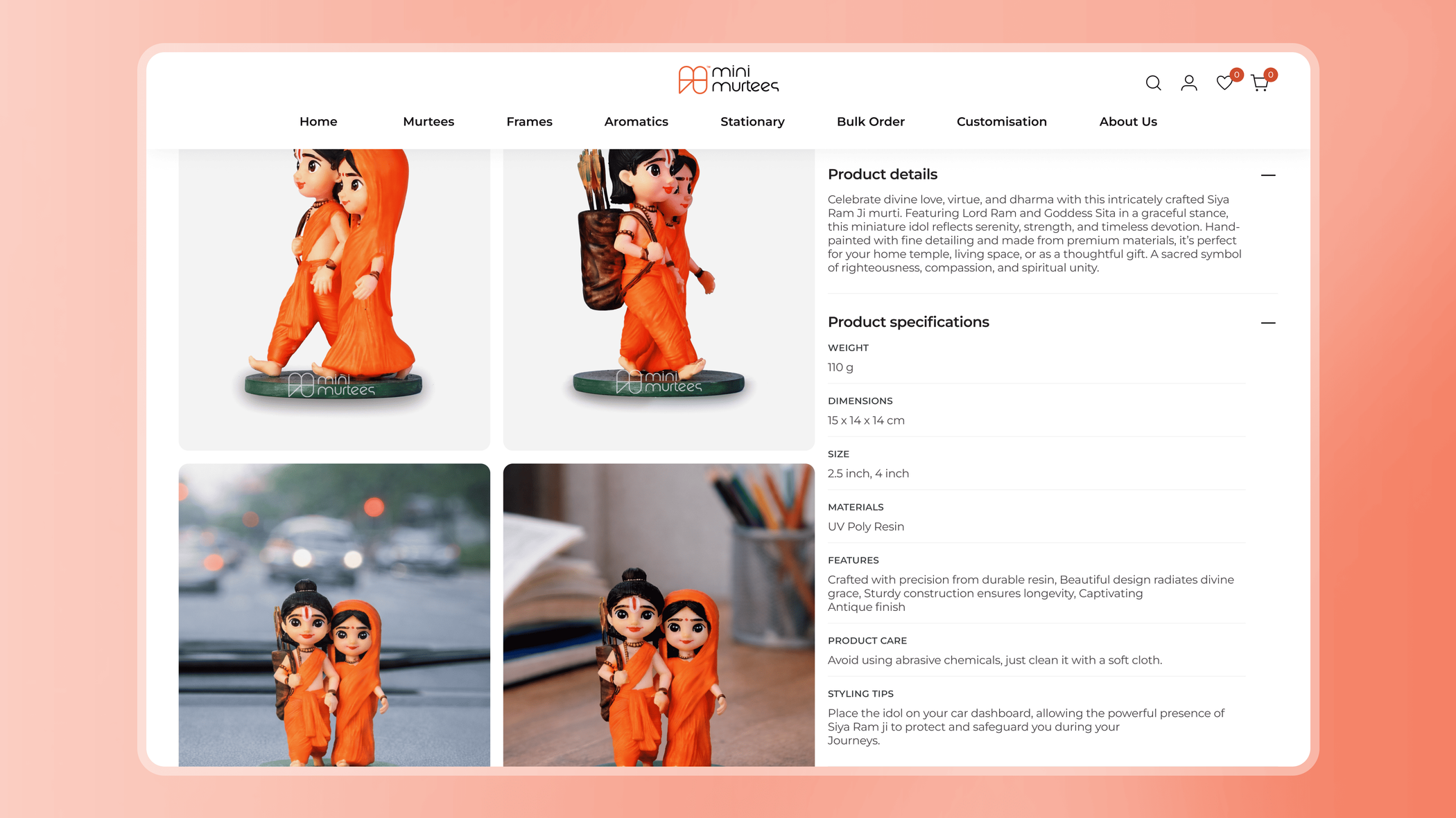
Encouraging Exploration
One of the opportunities in the redesign was to keep users engaged after they discovered an individual product. Instead of treating each product page as an isolated destination, I designed the browsing experience to encourage movement between related products and categories.
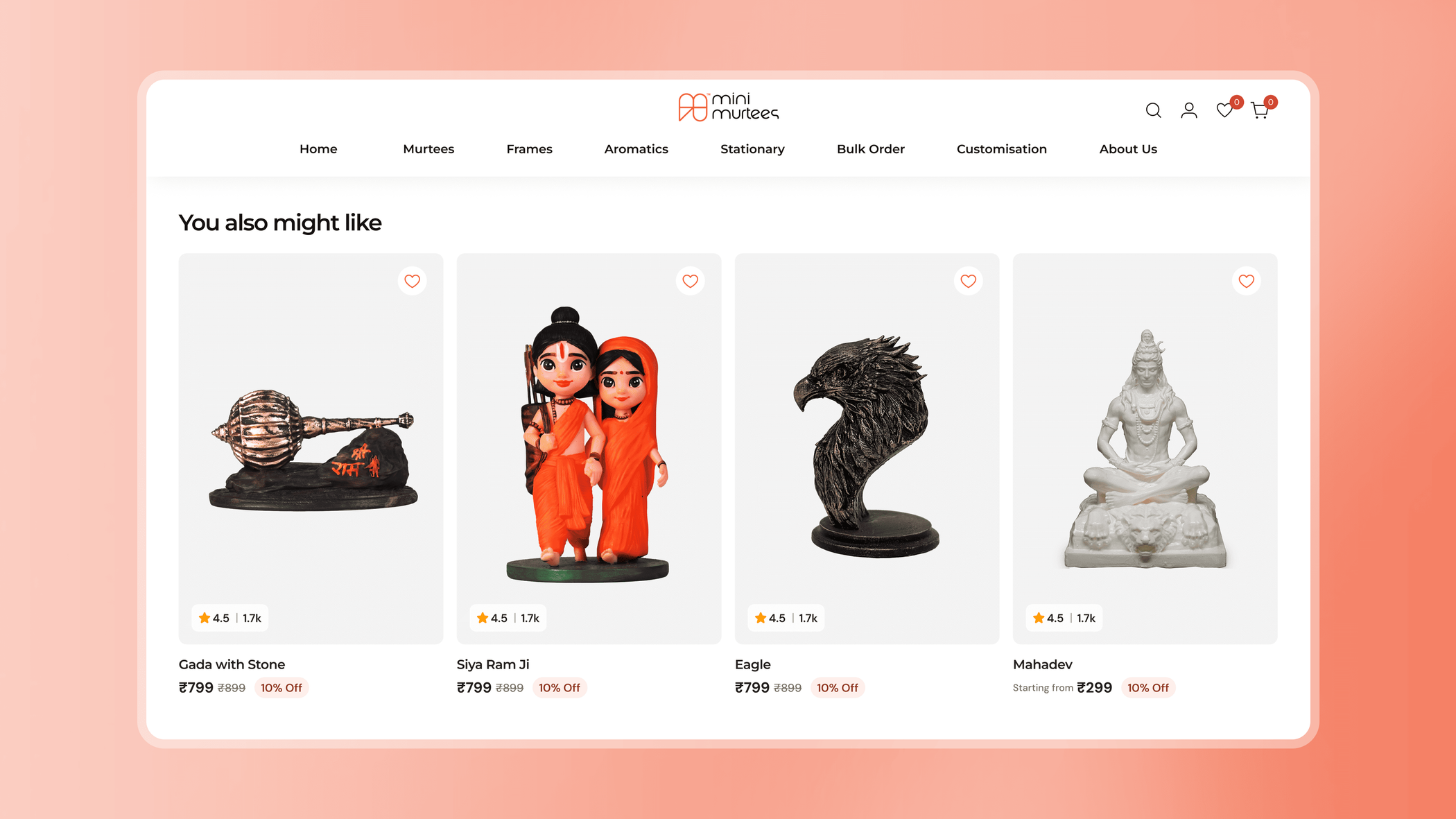
Designing for Conversion
Conversion does not begin at the Buy Now button. It begins when users can quickly understand what the brand offers, find something relevant and feel confident about the product.
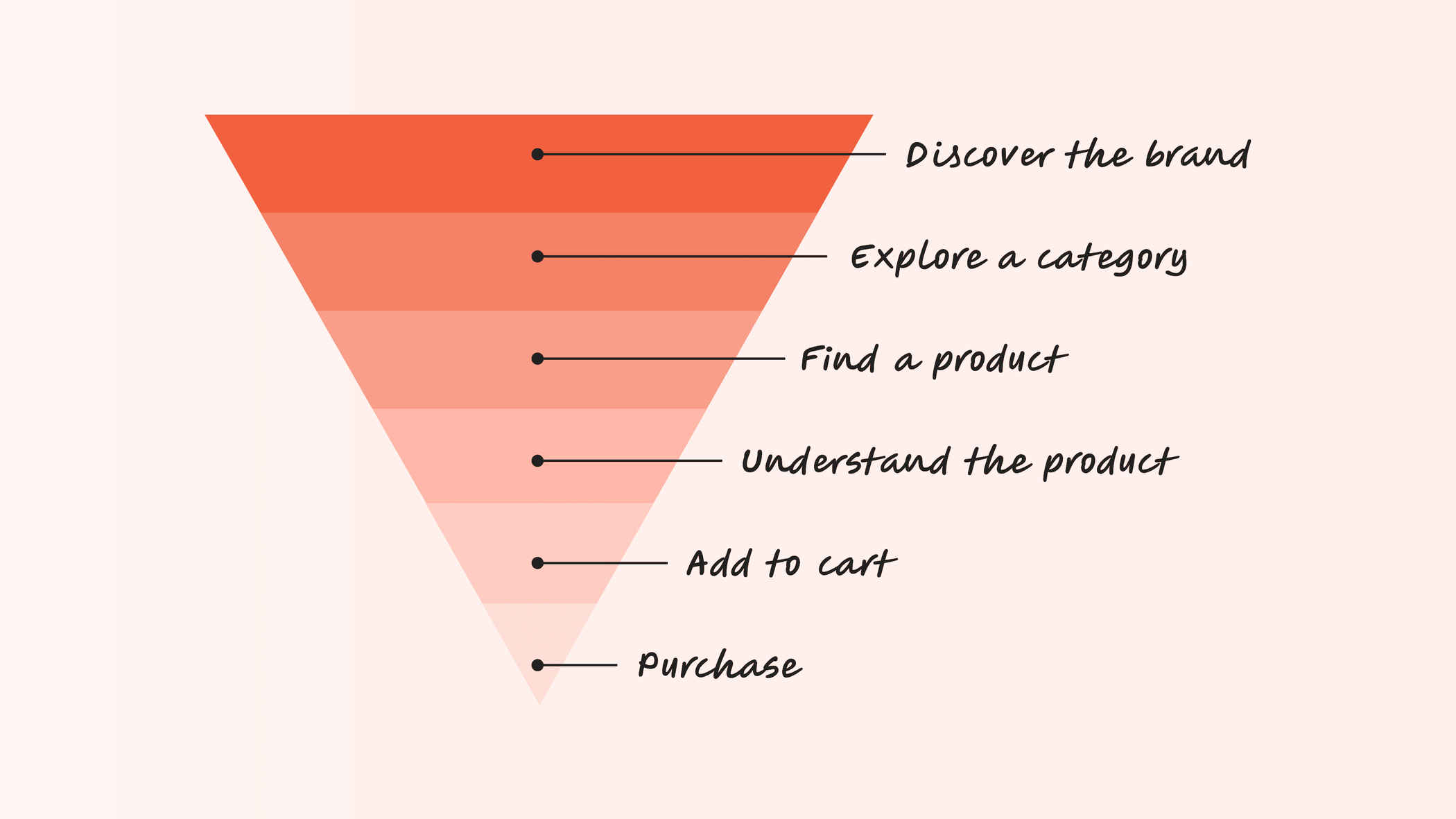
The Result
The redesigned experience gives Mini Murtees a stronger digital storefront where the craftsmanship of the products remains central while shopping actions are easier to understand. Users can explore the product range through clearer categories, browse products through a more structured catalogue and move through a more focused path toward purchase.
Outcomes
Clearer product discovery
I reorganised the shopping experience around structured categories and browsing pathways that helped users understand and explore the product range.
Stronger product presentation
I used product-focused layouts and visual hierarchy to give the handcrafted pieces more room to communicate their character and detail.
A clearer purchase journey
I created a more intentional path between discovery, product evaluation and purchase instead of treating each page as an isolated experience.
Better balance between brand and usability
I retained the personality of Mini Murtees while using familiar e-commerce patterns that made shopping easier to understand.
A foundation that can grow with the catalogue
The structured navigation, product cards and reusable page patterns created a system that could accommodate additional products and categories over time.
What This Project Taught Me
E-commerce UX starts before the product page
A purchase decision is shaped by everything that happens before users reach Buy Now. Navigation, discovery, product presentation and information hierarchy all contribute to whether users feel interested enough to continue.
Good visual design can support conversion
Making a website visually engaging and making it easier to shop are not opposing goals. When imagery, hierarchy and interactions work together, the visual experience can help users understand products and move through the journey more naturally.
Familiar interactions leave more room for brand expression
I did not need to redesign common e-commerce behaviours to make Mini Murtees feel distinctive. Keeping important shopping patterns familiar allowed me to express the brand through typography, imagery, layout and visual details instead.
The product should remain the hero
This project reinforced the value of restraint. For a brand selling visually rich physical products, the interface works best when it creates space for the products rather than competing for attention.