Making insurance easier to understand and easier to trust
Buying insurance can be overwhelming. Users need to understand complex coverage, compare options, share sensitive information and make a financial decision, all while feeling confident that they're making the right choice. I worked on the product and visual experience for INSURE24 by CARS24, helping create a digital insurance platform that made discovering and understanding insurance products feel simpler, clearer and more trustworthy.

My Role
UX Designer
I worked across product experience, visual design and brand development. I designed the web and mobile experience while collaborating with business, technical and legal stakeholders to translate insurance requirements into an intuitive customer journey.
By the numbers
6+ Insurance Categories
150+ Product Screens
20+ Custom Visual Assets
At a Glance
One place for everyday insurance needs
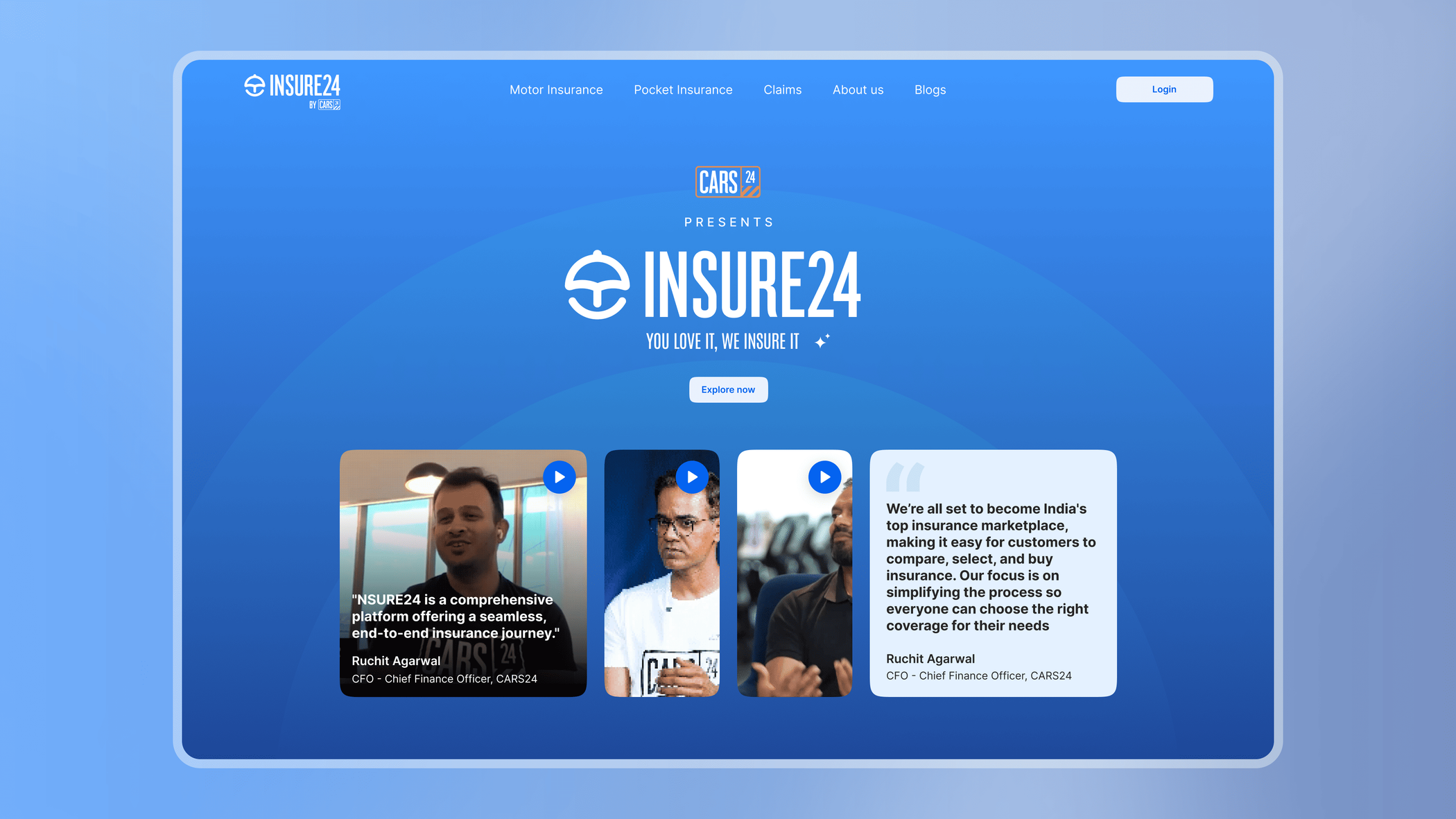
INSURE24 brought multiple insurance categories into one consumer-facing platform.
Users could discover relevant insurance products, understand their benefits and coverage, and move toward purchasing a policy through a consistent digital experience.
I supported the product with a visual identity designed to make a traditionally complex category feel more approachable.
The Challenge
Insurance creates friction before the user even starts
Buying insurance requires more trust than a typical online purchase. Users are expected to:
- Share personal information.
- Understand unfamiliar terminology.
- Compare financial products.
- Evaluate coverage and exclusions.
- Complete payments.
- Trust that the product will help them when something goes wrong.
The challenge was not simply creating a cleaner insurance website. I needed to reduce uncertainty throughout the buying experience without hiding information users needed to make an informed decision.
Three Problems I Needed to Solve
01. Build trust early
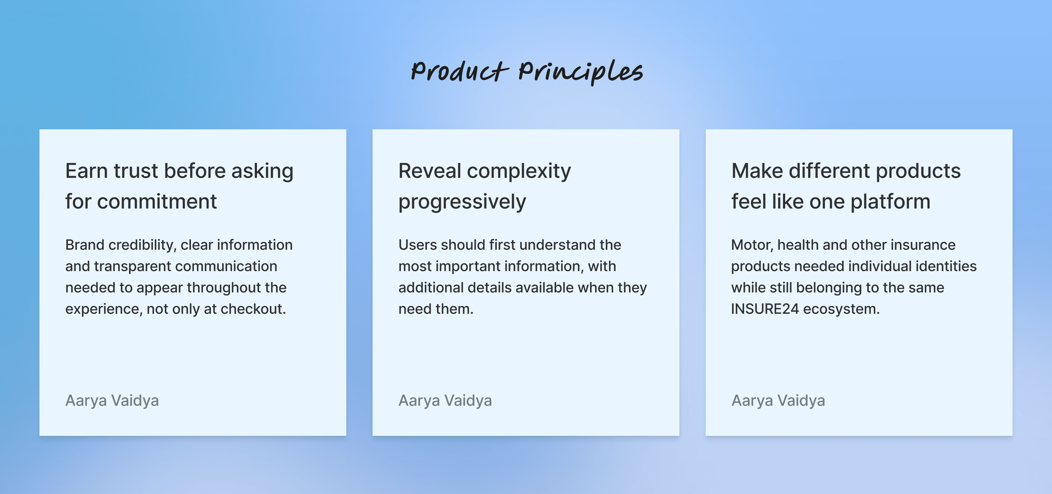
Users needed to feel confident before sharing personal information or proceeding toward payment. I needed the experience to communicate credibility and security from the beginning of the journey.
02. Make insurance easier to understand
Insurance products naturally contain detailed information about coverage, benefits, conditions and exclusions. Presenting everything at once could overwhelm users. Presenting too little could reduce transparency. I needed to find the right hierarchy between simplicity and completeness.
03. Balance users, business and compliance
An effortless user journey still needed to work within technical, business and legal requirements. That meant designing interactions that felt simple on the surface while supporting considerably more complexity behind the scenes.
Designing Trust
One of the strongest trust signals available to the new product was its association with an established consumer brand. Instead of treating this relationship as secondary information, I intentionally surfaced that INSURE24 was powered by CARS24.
This gave users an immediate point of recognition while INSURE24 developed its own identity.
Discovery
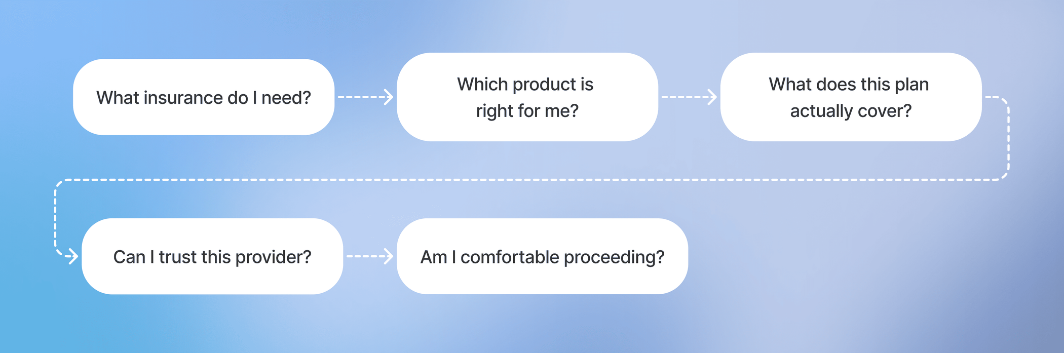
Instead of treating insurance purchase as one long form, I broke the experience into the decisions users needed to make along the way.
Product Principles
Brand Identity
INSURE24 needed to feel like its own product while benefiting from the recognition of CARS24. I worked on a visual identity that could scale across the website and other customer touch points.
Rather than relying on traditional insurance imagery and information-heavy layouts, I used approachable illustrations and simple visual language to make the brand feel more accessible.

Product Discovery
The platform needed to support different kinds of insurance without making the homepage feel like a catalogue of complicated financial products. I created clear entry points into each insurance category so users could begin from the need most relevant to them.

Creating a Scalable Product Language
As more products were introduced, relying only on text labels would make browsing harder. I developed a subtle colour-coding system supported by custom icons to give each insurance category a recognisable visual identity.

Information Design
Insurance comes with a lot of detail. Before choosing a plan, users need to understand what it covers, what they receive, and which conditions or limitations apply.
Giving every detail the same visual weight makes plans harder to compare. So I organised the information around the questions users were most likely to ask, in the order they would ask them.
What do I get?
Key benefits and coverage.
Is this relevant to me?
Important plan details and eligibility.
What should I know before purchasing?
Terms, conditions and additional information.

Simplifying Complex Concepts
Insurance terminology can quickly make a page feel dense. I introduced custom illustrations and icons alongside explanatory content to make technical concepts easier to identify and understand.

Designing the Buying Journey
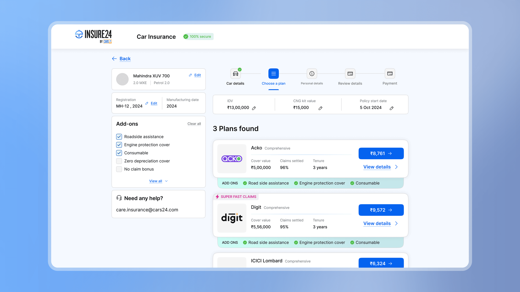
Once users understood a product, the experience needed to guide them toward the next step without introducing unnecessary decisions. I mapped key stages of the insurance journey and created clear entry points and calls to action throughout the platform.
Designing Within Constraints
Insurance experiences need to accommodate business logic, backend systems and regulatory requirements. A visually elegant interaction is not useful if it cannot translate into the systems responsible for completing the transaction. I worked closely with business and technical requirements to ensure the frontend experience aligned with the underlying product logic.
Mobile Experience
The platform needed to remain understandable across different screen sizes, especially when users were reading detailed product information or moving through purchase-related actions.
I adapted navigation, hierarchy, touch targets and information density for smaller screens instead of simply shrinking the desktop interface. The same insurance information remained available while the presentation adapted to the user's device.

The Result
The final experience combined product design and brand identity into one connected insurance ecosystem. Users could discover multiple insurance products, understand important information through clearer content hierarchy and move through a consistent purchasing experience across desktop and mobile. At the same time, the visual system gave INSURE24 an identity distinct enough to grow as a product while retaining the credibility of the CARS24 association.
Outcomes
One unified insurance ecosystem
I created a consistent experience across multiple insurance categories instead of treating each product as an isolated journey.
Stronger trust signals
I used the relationship with CARS24, clear information hierarchy and transparent product communication to reinforce credibility throughout the experience.
More understandable product information
I combined progressive information hierarchy, illustrations and custom iconography to make dense insurance content easier to scan and comprehend.
A scalable visual language
I built a system of colors, icons, illustrations and reusable UI patterns that could support different insurance products while maintaining one recognizable brand.
Responsive from the start
I designed the experience to remain clear and usable across both desktop and mobile instead of treating mobile as a secondary adaptation.
What this project taught me
Trust is part of the user experience
Before this project, I often thought of trust as something created mainly through branding. Insurance made it clear that trust is also built through interaction design, through transparency, predictable actions, clear language and communicating what happens next.
Simplification does not mean removing information
Insurance users need detail to make responsible decisions. The challenge is not eliminating complexity. It is structuring complexity so users can understand it progressively.
Visual design can solve information problems
Icons, illustrations and colour were not only aesthetic decisions. When used consistently, they helped people distinguish products, scan information and understand concepts faster.
Business constraints can improve design decisions
Working within backend and legal requirements forced me to think beyond idealised user flows. It taught me to design experiences that were not only intuitive in Figma, but realistic within the systems responsible for delivering them.